December 3rd, 2007


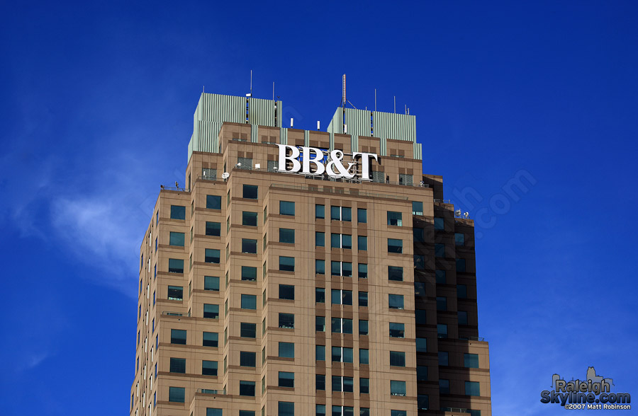
Two Hannover Square got an upgrade today: a huge, centered version of its Branch Banking and Trust rooftop signage logo. Perhaps it does not want to be overshadowed by that other building creeping up behind its back? Or maybe someone just bumped the Times New Roman font to 72 PT for a laugh.

New BB&T sign

New BB&T sign

New BB&T sign

New BB&T sign
The impact from South Saunders.

New BB&T sign

New BB&T sign
The new sign is much brighter than the old.

Thanks to “Brendan” for the heads up.

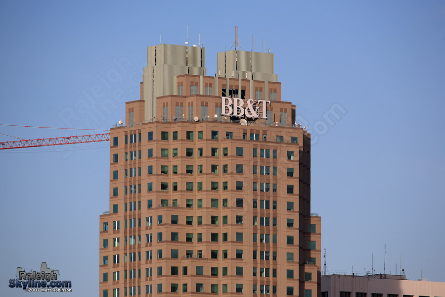
Here’s an overlay with the previous sign for comparison. It appears some microwave repeaters have also been added recently.
Old and New BB&T sign

1 Acorn2 Acorns3 Acorns4 Acorns5 Acorns (6 votes, average: 4.83 out of 5)
Loading ... Loading ...

This entry was presented on Monday, December 3rd, 2007 in the category Notes.
Comments RSS Feed.
PittsburghSkyline.com - MetroScenes.com

25 Responses to “New, larger, brighter BB&T sign”

  1. Unique1 wrote:

    Nice!

  2. aperson wrote:

    Look what a little competition can do! finally

  3. Brendan wrote:

    I like the overlay, the new sign deffinitely makes a difference. Now if, like you said Matt, they would trim the 440 shrubs around the southern route, people would get more than 3 or 4 glimpses of it.

  4. TC wrote:

    Sorry, that building is ugly (since it’s completion in 1991)! The city needs to eliminate that facility as a focal point from post cards and advertising. Again, an eyesore!

  5. Lew wrote:

    That buidling is SERIOUSLY ugly. At least leave the green lights up year round. Seems to help at night, but overall it’s so boring!

  6. PS wrote:

    Love your photos. Great website. It’s looks like BB&T has a lot of pride in this building and they should. Ugly? Hmmm…

  7. Lance wrote:

    I don’t think the BB&T building is ugly. It is not the most interesting building in the world but there are a lot uglier ones done.

  8. Ernest wrote:

    I have to agree with Lance… Two Hannover Square would not win any “beauty” contest, but it is not the ugliest building, either. Also, it is amazing what having RBC Centura’s logo in the future skyline can do to the ego of the competitors :LOL: Thanks for the pics, Matt.

  9. Brendan wrote:

    I really think the BB&T building should plant its balconies all up the corners of the structure, with greens, maybe some hanging vine-like plants. The accents would go a long way. (ala, Myan temple-ish)

  10. Michael Bryan wrote:

    Love the overlay picture. That’s cool.

  11. Mike wrote:

    I guess BB&T is the first to really utilize the 200+ft high = more signage sqft rule that was brought on with the Capital Bank Sign(which is a beauty). This sign is one heck of a sign and makes Raleigh one step closer to a big city.

  12. Darren wrote:

    Man, that sign is huge! I can see the BB&T logo from Centennial Campus at NCSU, driving down the Parkway to Lake Wheeler.

  13. emutiny wrote:

    id like to know what is so ugly about the building. I think it looks top notch.

  14. Matthew Brown wrote:

    I agree. The BB&T building is the best-looking major building downtown since the Art Deco County Office Building (originally Durham Life Insurance). It looks great lit up at night, especially.

  15. Leo wrote:

    dude, the days inn on lane street got a new sign, where’s the photo series on that?

    i kid. great pics, the sign looks good and can be seen from the beltline. they should do the other side also.

  16. TZ wrote:

    Wachovia’s the building that started the height wars. I wonder if they’ll try to counter BB&T with LED’s or a bigger sign. Personally, I’d like to see some LED’s.

  17. Scott C wrote:

    Actually the original design for the Wachovia building had a spire on top. If they had left it on it probably would have been the tallest building since 1991.
    The top was supposed to look sort of like this…

    _!_
    ! !! !

  18. Scott C wrote:

    Sorry, I can’t get everything to line up. Maybe someone has a picture of the Wachovia buildings original model. I used to have a pic that was on the cover of a local paper (spectator,Independent or something like that) But no longer have it.

  19. pirmin wrote:

    The building is not very good looking to me because it appears unfinished at the top, as if under perpetual construction, and the “mickey mouse eared” looking metal siding there now is visually insulting. Had the spire been completed as originally designed, it might have made an okay tower. (I can’t believe the city allowed the spire to be dropped from the approved, originally planned design. I guess it was just that desparate to have the development at the time.)

  20. Paul wrote:

    Ugly building, yes. With an UGLY unfinished-looking top. UGLY, UGLY, UGLY. It looks like the building never was completely finished and some corrugated metal was thrown up there as a temporary fix. Too bad it’s still there. In my opinion, I think that those two ugly metal “ears” ought to be constructed of the same material that the rest of the exterior of the building is made of (granite?). Only then will the building look complete. It’s not a bad looking building, but the top is HIDEOUS. I also think that the new BB&T sign up there is too bright. At least at night the glare of that sign obscures the view of the two hideous corrugated metal “ears” right behind it. C’mon BB&T, do something about that ugly “spire” of yours. I’ve lived in Raleigh for 15 years and I’m still waiting for your building to look like it’s completed.

  21. Scott C wrote:

    Hey guys, It wasn’t the BB&T building that originaly was to have the spire. It was the Wachovia bldg. I think it looked a lot better with the spire. I wish I still had a pic of the original model. I still don’t know why they never put the spire on top.

  22. Sign Maker wrote:

    FYI, the sign is illuminated with approximatly 2500 LED’s which draw just over 18amps in total… this sign is very “green”!

  23. TC wrote:

    Agree, it is an ugly building.

    Anyone know who owns the building?

    Whoever it is must be involved with the Raleigh marketing team, that ugly building keeps getting center stage on post cards, etc.. That building was finished in 1991, it’s time the owner makes an investment to re-configure the top of the building (it’s an eyesore). The architect and developer should have been fired for their lack of vision.

  24. Lance wrote:

    Once again, I think the building is okay. I am glad they are taking a little pride in their building and our skyline by advertising the new larger green BB&T sign. It seems that people are starting to take interest in our city.

  25. Ernest wrote:

    While impressive architecture is a huge plus, when investors look at a city they are more interested in its financial stability and demographics. I would be more upset about One Hannover Square, Marriott Hotel, County Jail and the County Courthouse before I get pissed about Two Hannover Square (aka BB&T building). It would have been nice to see if the owners of Two Hannover Square are interested about image enough to replace its top with something more inspiring, but unfortunately spires and crowns don’t generate income. Not to mention that from the money shot Two Hannover Square is still prominent.


Leave a Comment