New Wachovia Rooftop Sign Mockup
March 27, 2008 | Switch to thumbnails
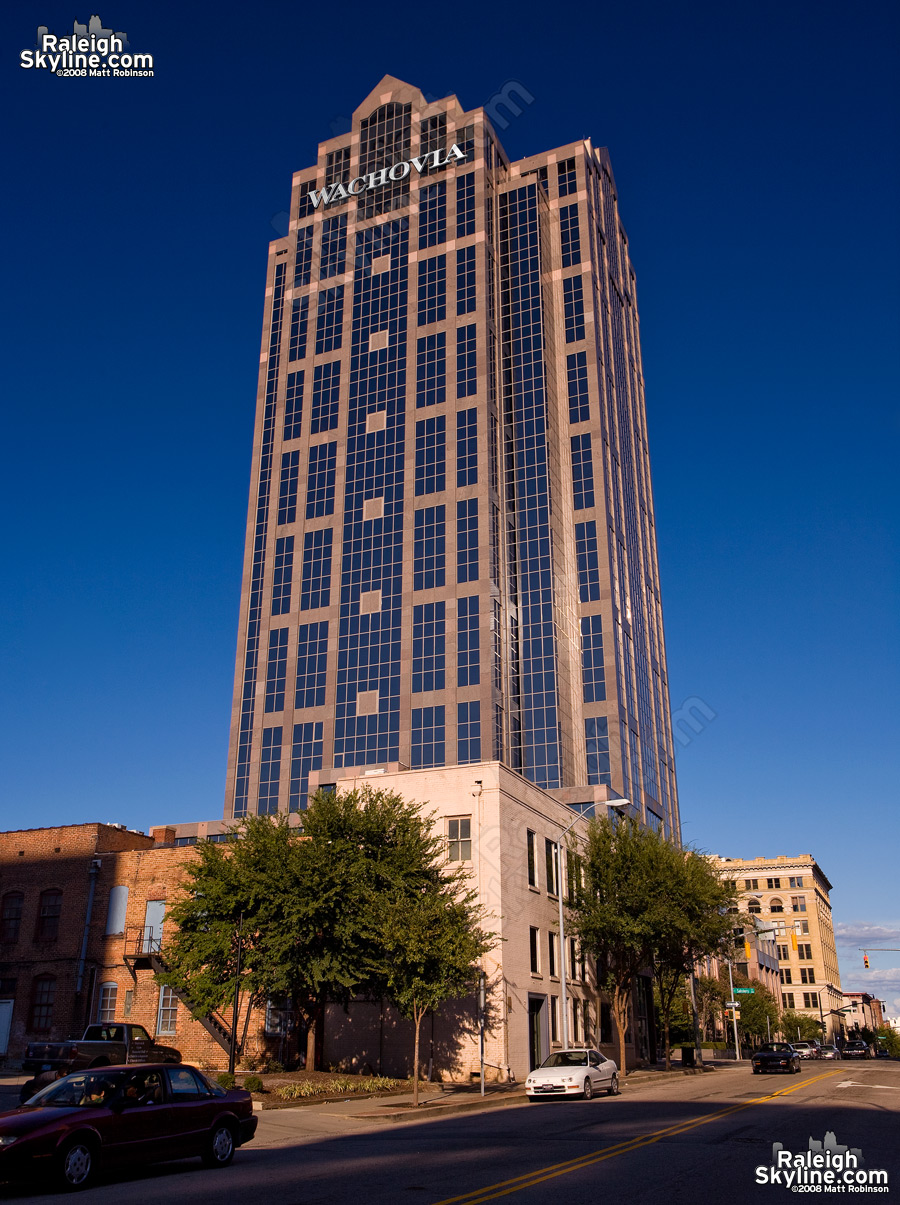
There has been recent news that Raleigh's Wachovia Capitol Center wants to join the rooftop signage and logo war. This past December, with the threat of RBC Plaza stealing the focal point of the skyline, Two Hannover Square upgraded the highwall BB&T logo to something much larger and brighter. Now that RBC Plaza has irrevocably eclipsed Raleigh's two former champs in null and soon to add its own logo to the mix, Wachovia feels that it must hoist their letters to the sky. I don't blame them, however. As many people have voiced on this site, particularly in the evening, shamefully Wachovia fades into the night as almost an afterthought. I welcome anything that can be done to add some glitter to the Raleigh cityscape- with some limitations, of course. I wouldn't propose bright green lasers constantly scattering into the atmosphere or anything like that.
So what might Wachovia Capitol Center's new signage look like? How many faces will it be on? Will it contain the Wachovia's wavy graphic identity logo? How big or small? That's anyone's guess. I'm sure someone knows these answers. I'm left to speculate and offer a preview of what we might see when we look to the top of Raleigh's third tallest building.
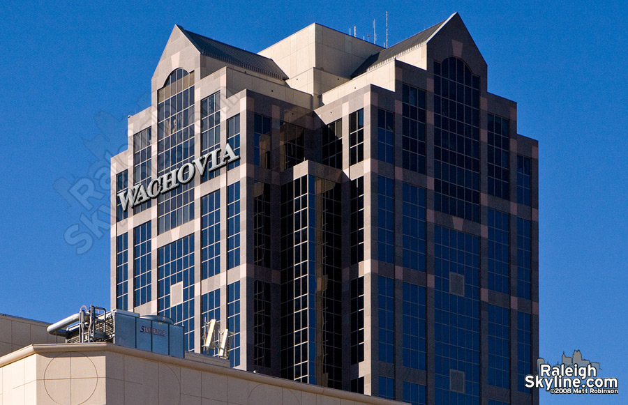
Wachovia sign facing the east.
Wachovia sign facing the south.