People traveling into downtown Raleigh via South Saunders Street will be greeted with a rather large welcome sign as of this week. It comes on the heels of other similarly styled way finding signs around the downtown grid. At least it is better than that temporary Extreme Home Makeover sign from early 2007, seen here.
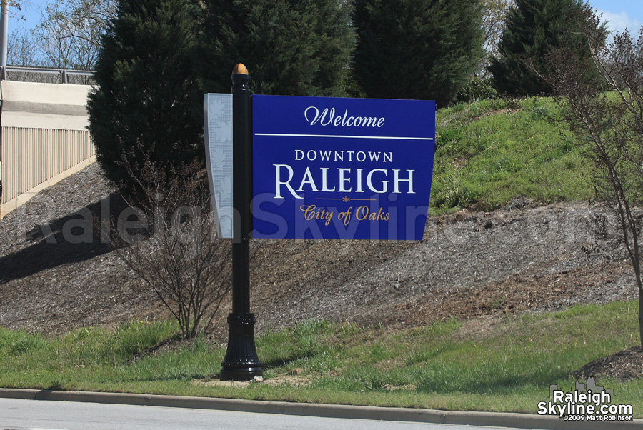
The New “Welcome to Raleigh” sign.
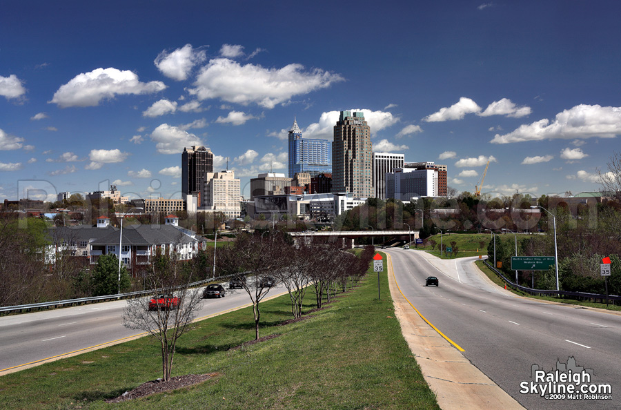
Look to the bottom right of the MLK overpass to spot the sign.
April 3rd, 2009 at 5:06 pm (#)
This photo looks exactly like the rendering from 12 – 18 months ago…time passes so quickly…thanks Matt!!!
Oh yeah, I see the sign.
April 4th, 2009 at 11:16 am (#)
I was there yesterday, around 6:30pm, taking photos 🙂 I saw the welcome sign, which is a nice addition. Of course, an even nicer addition would be another 5-6 towers between 600ft and 900ft, nicely positioned in the skyline, but I guess we’ll have to wait a little longer for that :LOL:
Thanks for the photos, Matt!!!
April 5th, 2009 at 12:58 am (#)
What a beautiful day!
April 8th, 2009 at 8:14 am (#)
damn raleigh got along way to go…
April 10th, 2009 at 2:26 pm (#)
I’m surprised the sign is blue — as a former City employee, there was always a fuss over colors. Everything had to be green and gold like the city seal.
April 10th, 2009 at 6:14 pm (#)
it’s because nc is a blue state now, after the 08 election
😉
April 14th, 2009 at 11:12 am (#)
and boy how my paycheck knows it!
April 14th, 2009 at 4:17 pm (#)
The sign (and all the new downtown signs pointing out local attractions) looked pretty purple to me when I saw it yesterday. Which is an even stranger color selection….
April 14th, 2009 at 4:19 pm (#)
^they are very, very blue. Might want to go get those eyes checked. (no offense intended)
April 15th, 2009 at 9:04 pm (#)
No they’re totally purple.
April 20th, 2009 at 8:24 am (#)
Overall, look good, but the blue is ugly (Green and gold would have been better)